TL;DR — Behold! A handful of free & valuable lessons product managers can glean from Twitter’s latest changes to their user experience.
Thank goodness for ‘Jeff Bezos and Alexa buying Whole Foods by Accident’ memes. Without them, we might still have to endure the weeping and gnashing of teeth both from, and about the world’s grumpiest social network.
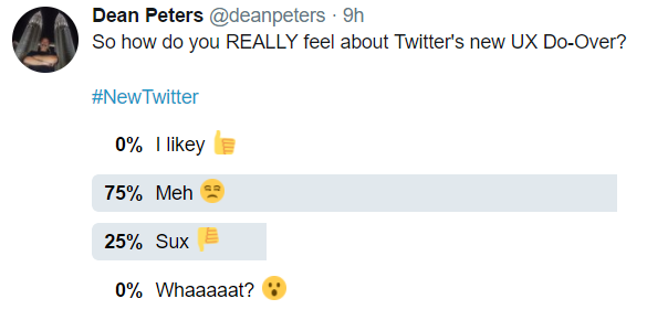
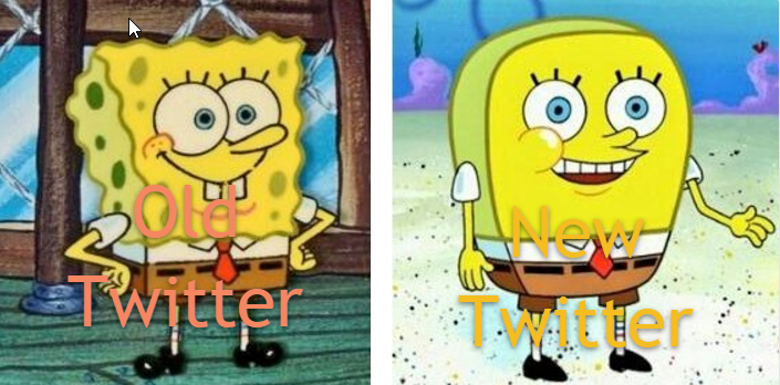
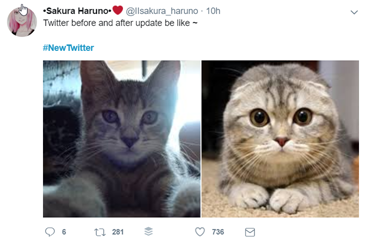
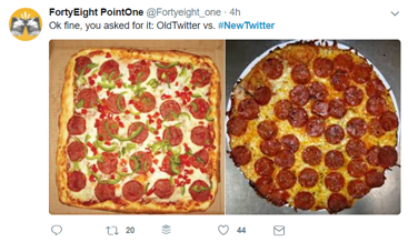
I am of course talking about Twitter’s most recent redesign, and the hilariously creative ridicule it received in reward of its efforts.
And while not nearly factually informative as the blog post about the new features by Twitter’s VP of User Research & Design— it being Friday — I thought I’d share some my own favorite acts of ‘snarcasm’ in response to said changes.

As we wipe away our tears of laughter, I think there is at least a handful of take-aways product people such as myself can take away from this latest kvetch-fest.
So let us count the ways:
- Software users tend resist change, so invest in titanium trousers.
One doesn’t have to dive too deep into the Internet’s archives to find that change will always inspire blow back by some segment of one’s user base.
The trick is to have performed enough feature-toggle controlled pre-release/beta research so you’re not entirely caught off-guard by it.
For example, as part of Twitter Product, I might have prepared and dribbled out some of my own self-effacing, yet educational humor to let people know of some of the very useful changes that went live yesterday. - If everyone else jumped off a cliff, would you as well?
Specifically I’m referring to the replacement of the iconic re-tweet icon with a more ubiquitous iOS-like chat bubble. And in a Google Plus like move to distinguish at a glance people, the ever popular rounding avatars.
The point being to consider the history and value proposition of making modifications similar to those introduced by domain competitors in the past. - Don’t assume what works well in one popular mobile context is readily accepted on the other.
I personally like the consolidated account navigation, along with the more consistent typography. All that said, I would advise caution to any product manager in the mobile space opting to modify the iOS user experience solely based on successes enjoyed on Android; and vice versa.
The personas that inspire loyalty on each of these platforms are different enough to me seek out feedback from other sources before implementing alignments in mobile gestures and information hierarchy. - If you don’t take care of the elephant in the room, nothing else much matters.
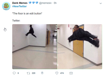
We are of course talking about the lack of an edit feature on Twitter.
All improvements — regardless of how useful — will have their launch party piddled upon until such an unpopular pain point is relieved. - Don’t be discouraged.
I have little doubt that some of these changes will increase engagement on Twitter. Especially opening web links in the Safari View Controller for iOS users is … a huge win for said segment in terms of tracking privacy, fraud website detection, and ad block controls.
Bottom line is this, despite yesterday’s short-lived acrimony, I don’t think people are going to “fire Twitter” for any of its changes yesterday. To what degree which features increase what engagement an exercise in Twitter adoption analytics in which I’d personally love to participate.
YMMV